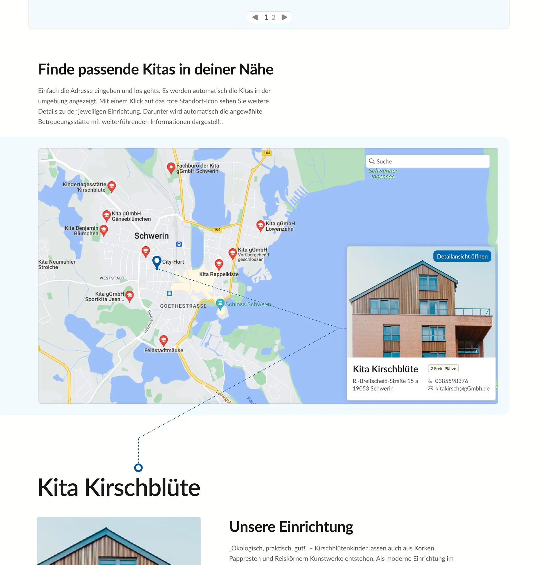
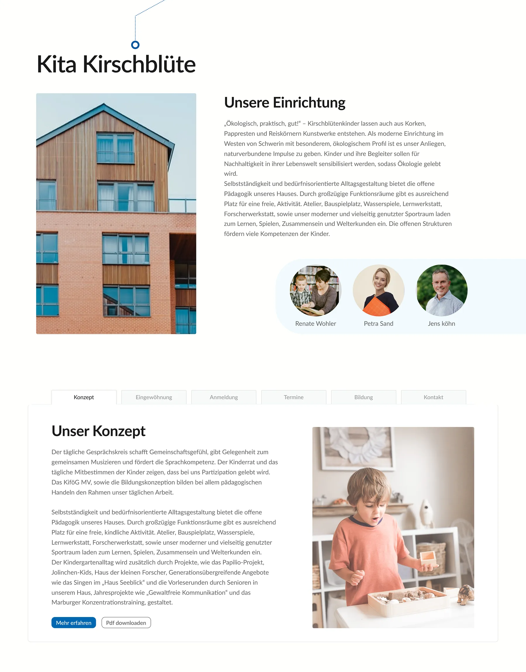
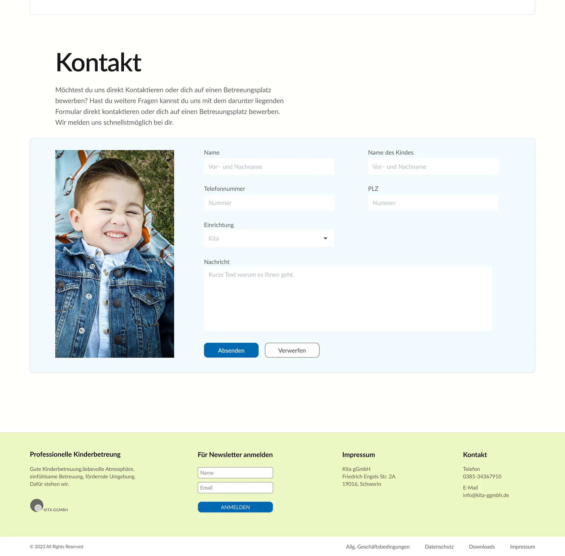
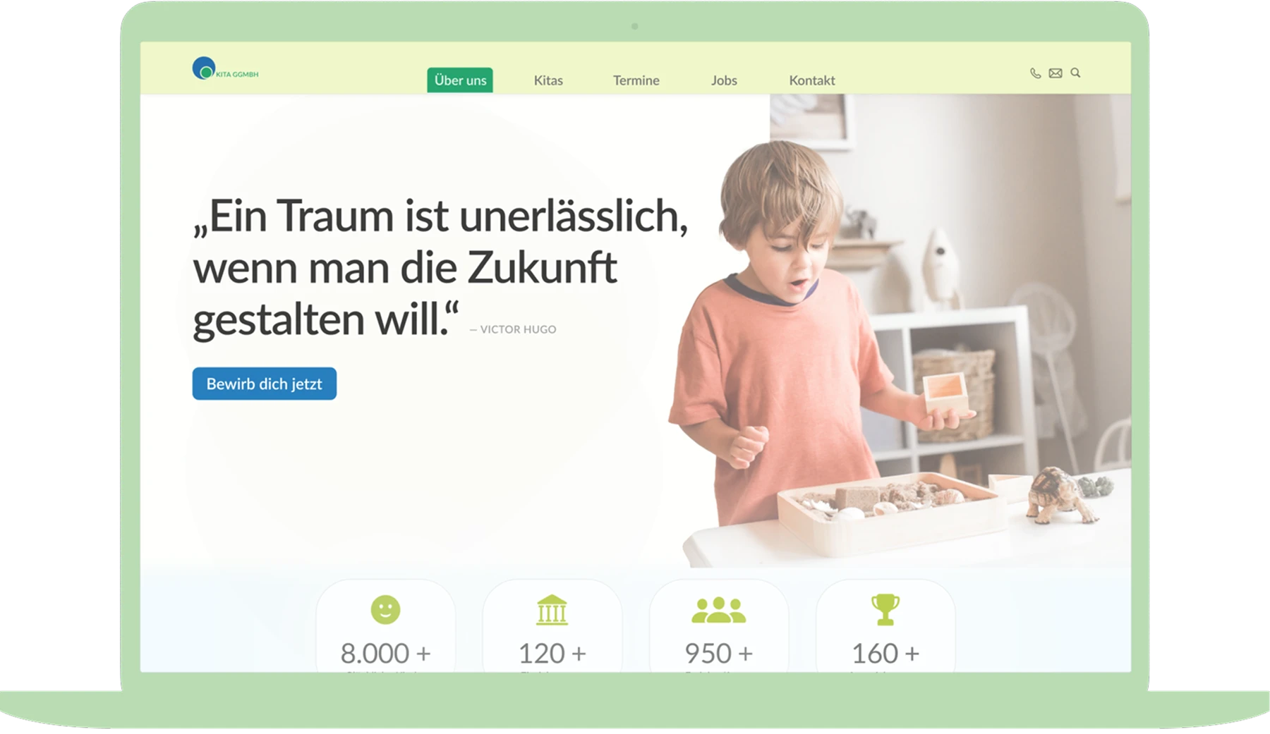
Helping families find childcare faster and easier

As part of a UX course in my second semester at the University of Applied Sciences Potsdam, I redesigned the website of Kita gGmbh. The project connected my background in social work with my growing design practice.
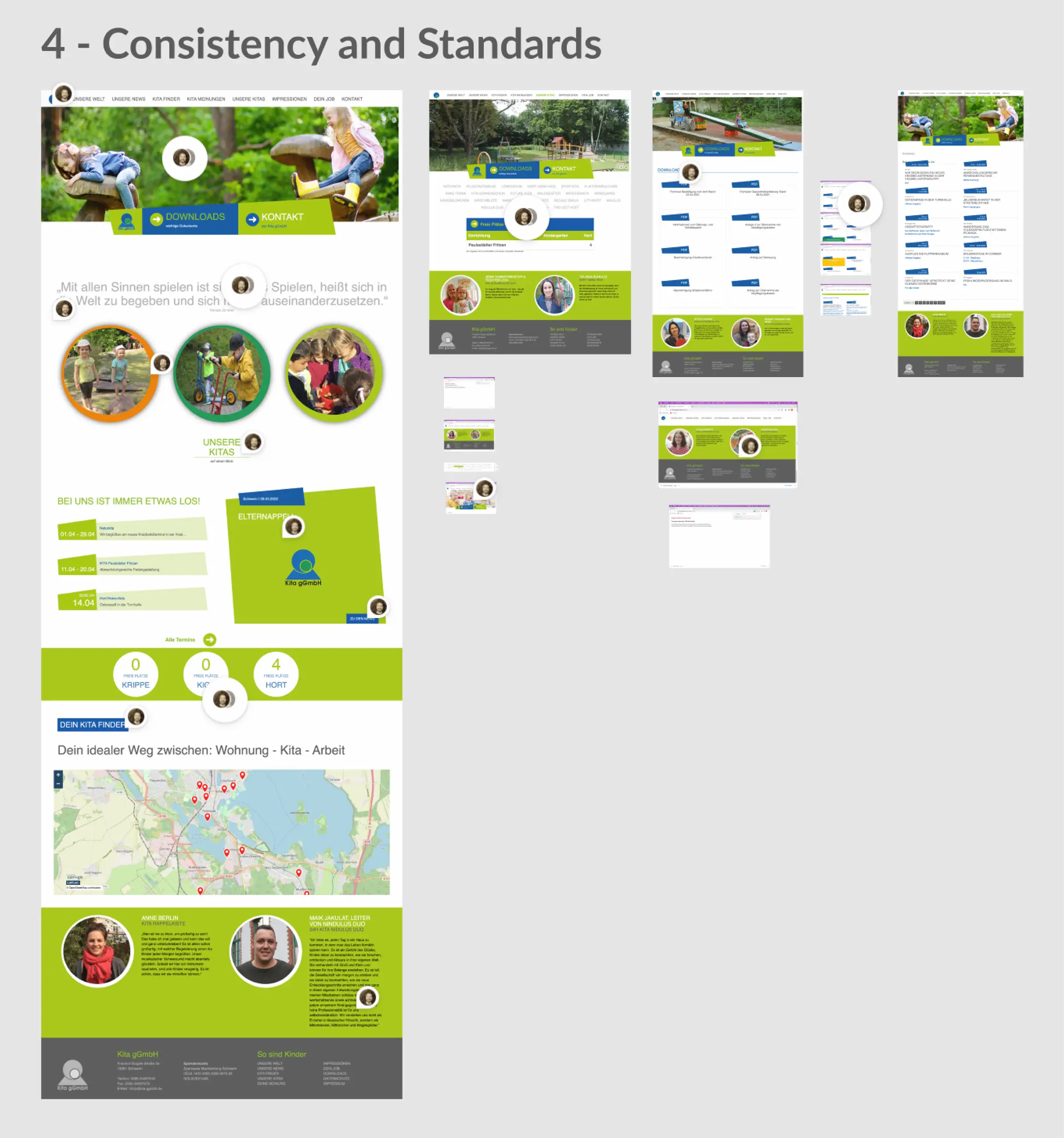
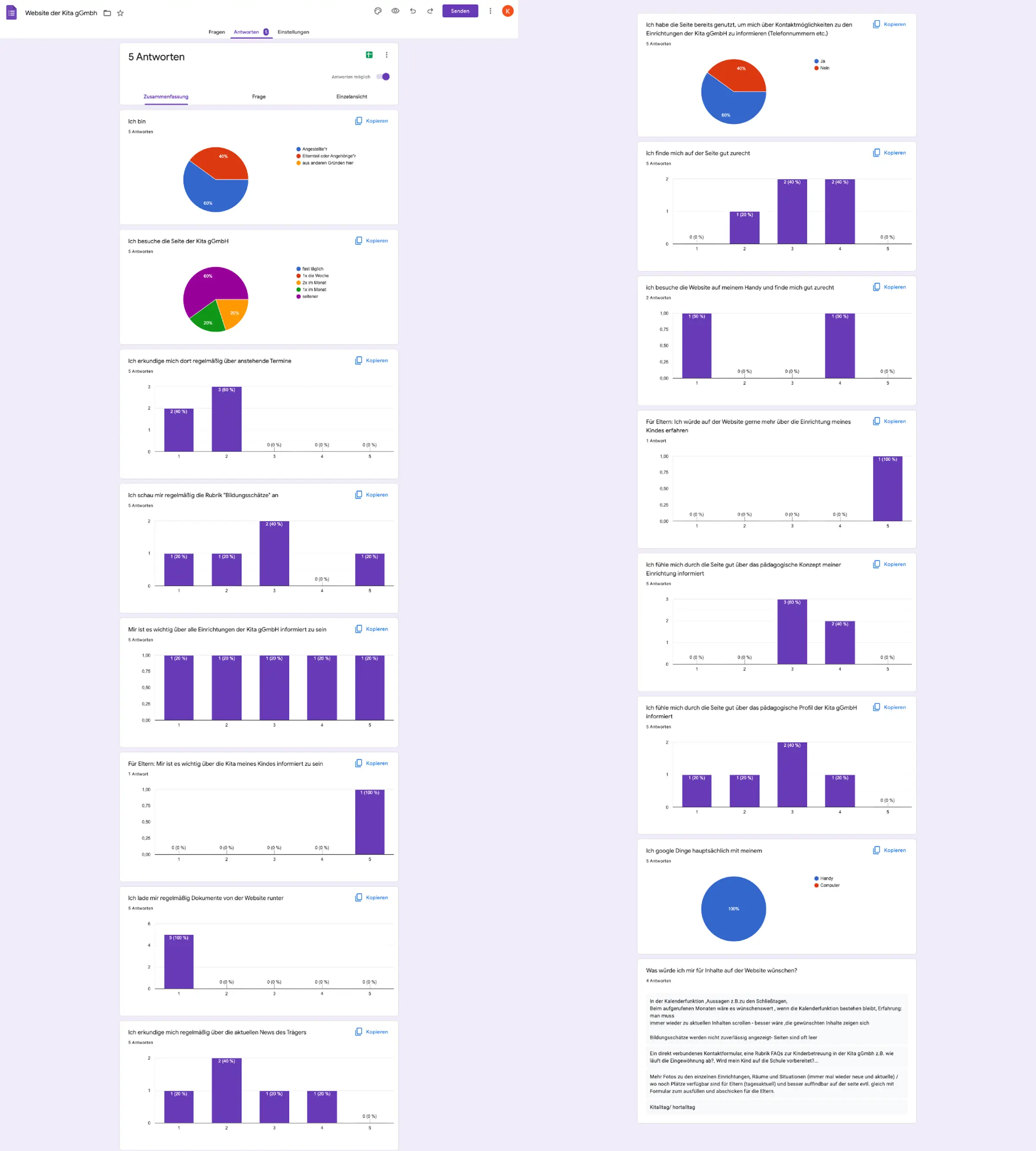
A heuristic evaluation revealed over one hundred usability issues, including unclear navigation, fragmented structures, and missing accessibility features. Interviews, surveys, and user testing deepened these insights.
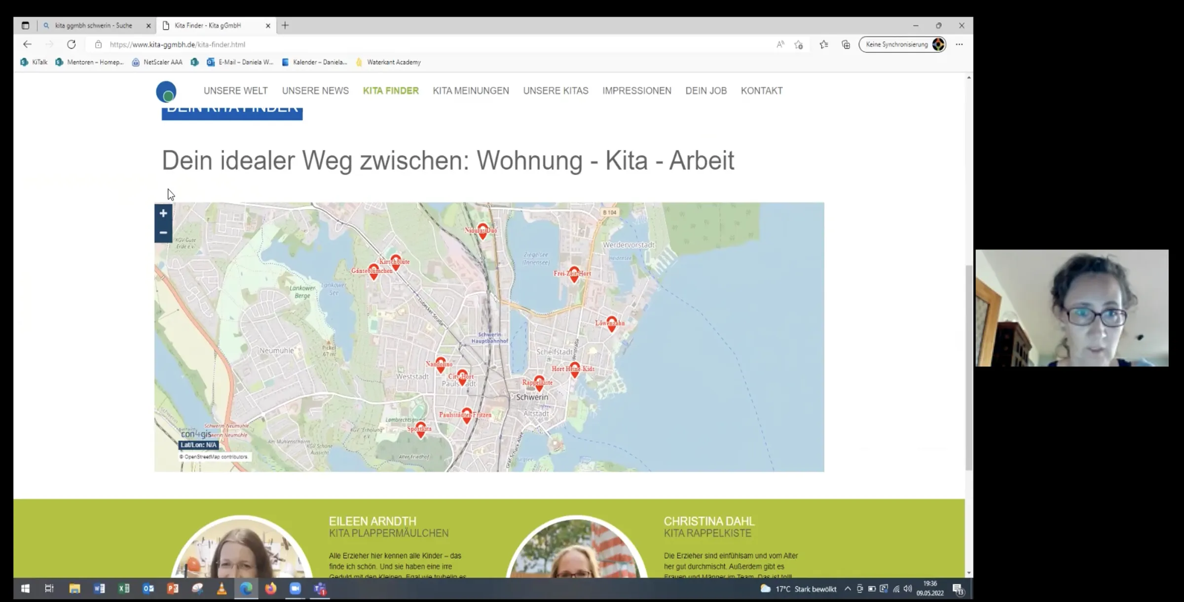
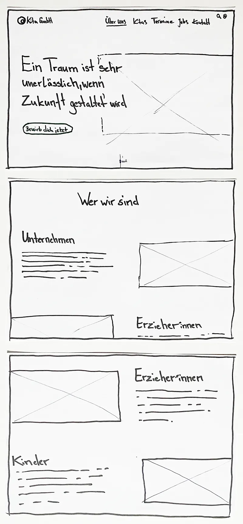
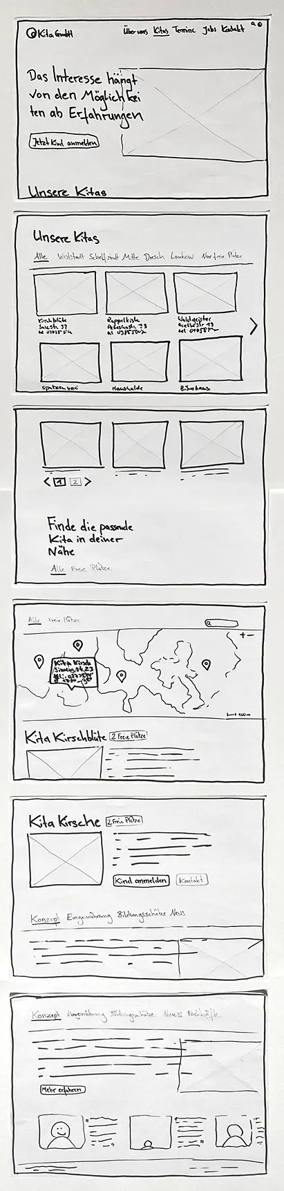
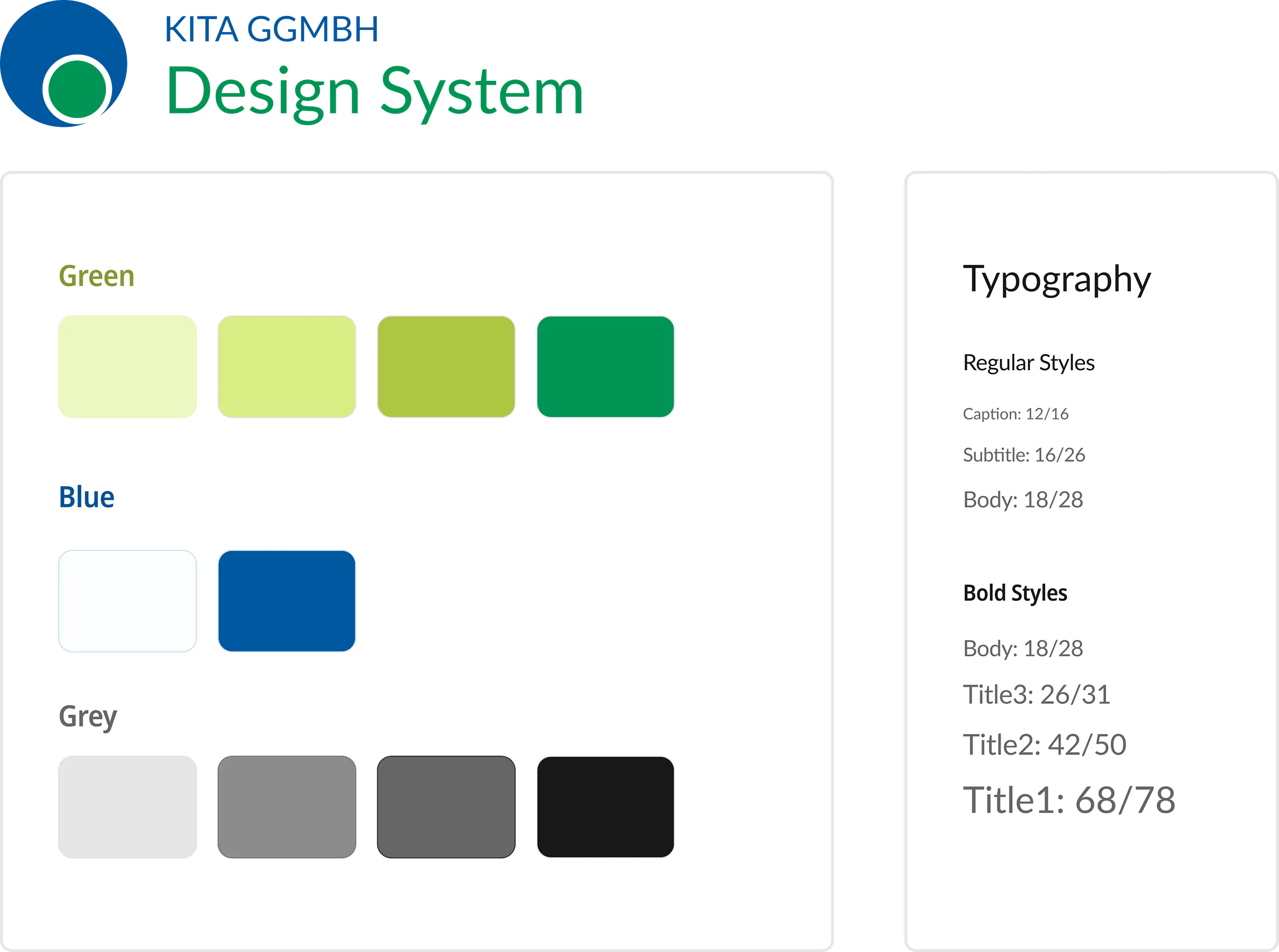
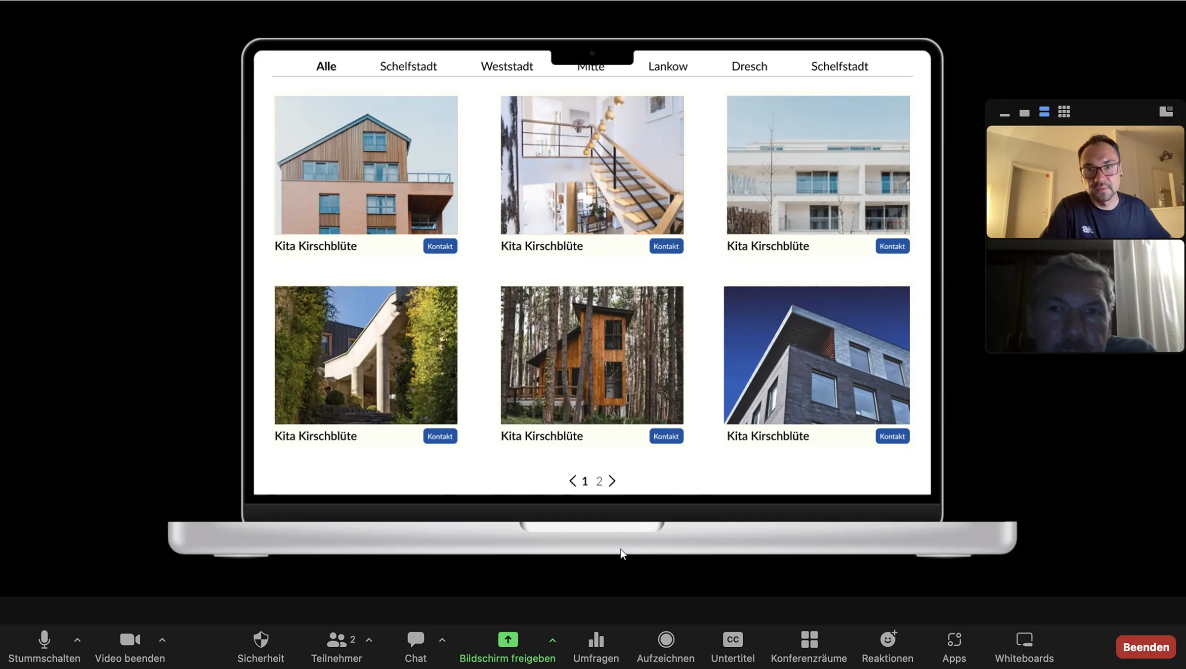
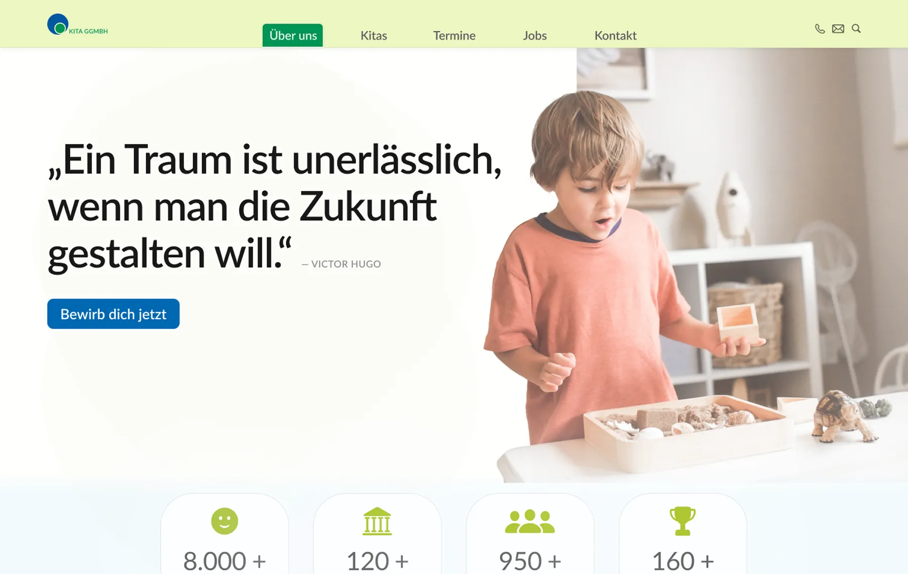
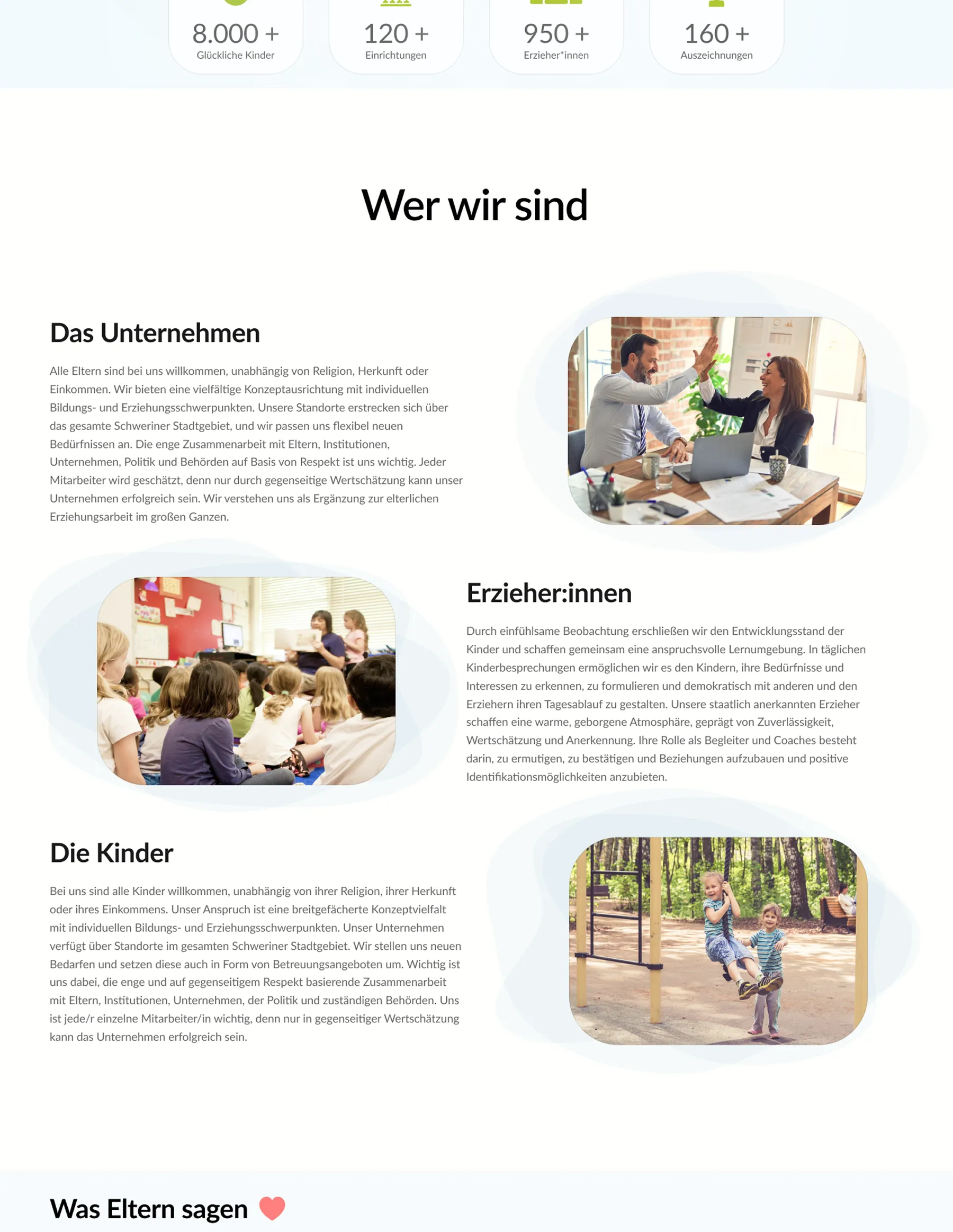
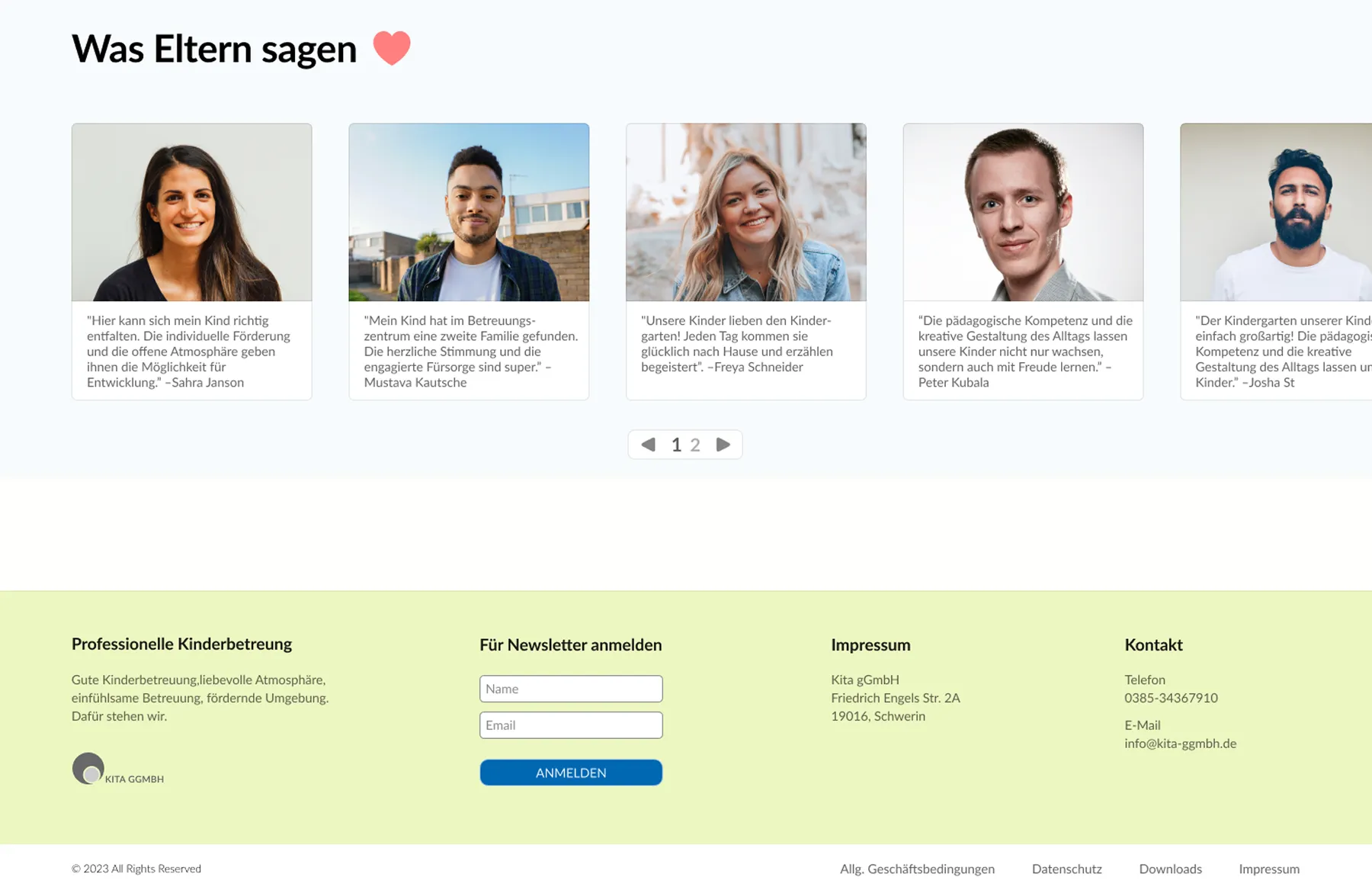
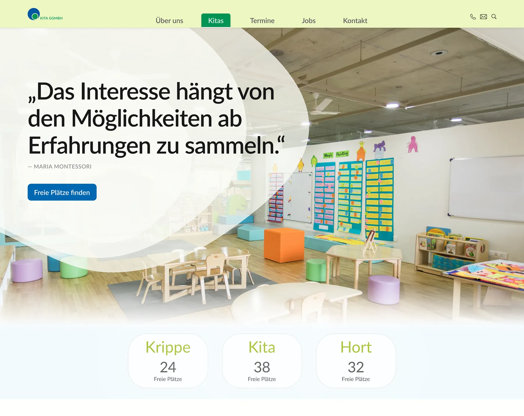
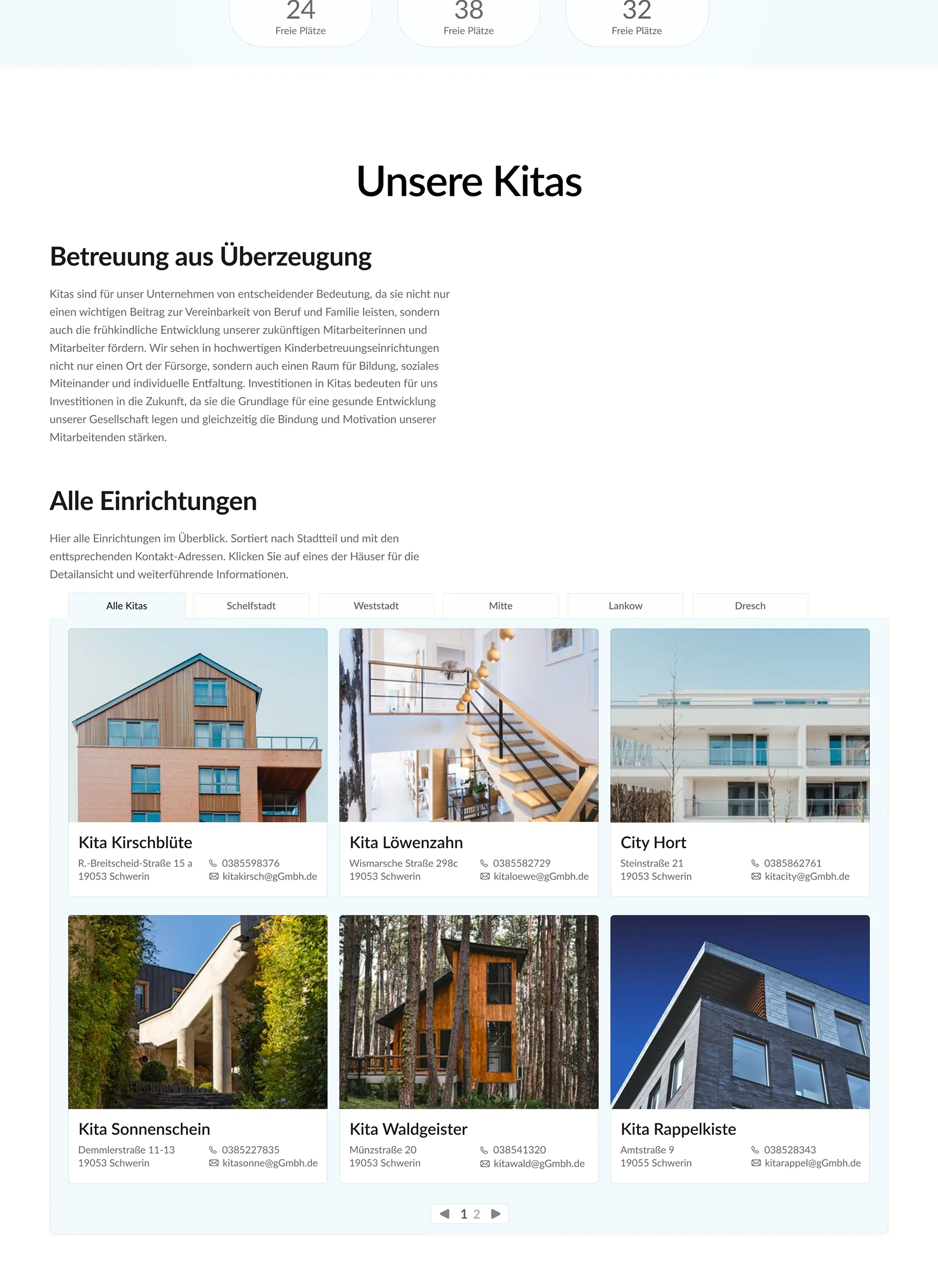
Based on the research, I restructured the information architecture and redesigned the interface in Figma. The result is a clear, supportive experience for families, aligned with the organization’s existing brand identity.
Role
Design
Interviews
Testing
Presentation
timeline
April 2022 –
June 2022
team
Kilian Wachowiak
Challenge
Many childcare providers still rely on outdated and visually overloaded websites that make it difficult for parents to find relevant information or a daycare spot.
The website of Kita gGmbH had unclear navigation, fragmented structures, inconsistent language, and lacked basic features such as search, contact forms, and a functional responsive design. This led to confusion for parents and increased operational effort due to repeated inquiries and missing information.
Approach
My goal was to rethink the site’s structure and content to better support the needs of all stakeholders. I followed a user centered design process with a clear focus on structure, clarity, and accessibility to create a coherent and reliable experience.
Research
I began with a heuristic evaluation to uncover structural and usability issues. An online survey provided initial quantitative insights into user needs and recurring friction points. Building on this foundation, I conducted interviews with parents and staff to gain deeper qualitative understanding of expectations, pain points, and communication gaps. The findings were further examined through moderated user testing sessions.
Based on these insights, I restructured the content, defined key user flows, and explored alternative navigation concepts. Paper prototypes enabled early validation before translating the concept into a high fidelity prototype in Figma followed by user testings to validate the improvements.
Heuristic Evaluation
As a first step, I conducted a heuristic evaluation of the existing website using Jakob Nielsen’s 10 usability heuristics as a framework. I systematically reviewed the interface and documented more than 100 individual issues.
The problems ranged from unclear navigation and inconsistent labeling to missing system feedback, broken links, and a lack of mobile responsiveness. Interactive elements were often not recognizable, and essential features such as search, filtering, or clear calls to action were absent.
The evaluation showed that the weaknesses were structural rather than purely visual, indicating the need for a redesign rather than small adjustments.
Survey
To gain broader insight into parents’ perspectives, I conducted an online survey focusing on expectations, information needs, and recurring pain points when visiting a childcare provider’s website.
Five parents participated. Despite the small sample size, the responses revealed consistent difficulties in locating essential information such as available spots, contact options, and registration details.
“I check the website for upcoming events and appointments.”
– 1: does not apply at all, 5: fully applies
Survey findings:
  • Difficulty locating essential information such as available spots, contact options, and registration details
  • Structure perceived as confusing and outdated
  • Need for clearer navigation
  • Desire for accessible language
Interviews
To deepen the understanding of the target group and contextualize the survey results, I conducted semi structured interviews with three parents who had recently searched for daycare options in the area. The conversations explored their online search behavior, their interaction with the provider’s website, and their expectations during this process.
A recurring theme was the lack of clear and up to date information. Participants reported difficulties in finding details about available spots, the pedagogical approach of individual facilities, and basic contact information. Inconsistent navigation and an unclear page structure contributed to a sense of disorientation and increased cognitive effort during the search process.
Stakeholder Perspective
To understand the internal perspective, I spoke with a representative from the administrative team. The conversation clarified strategic expectations toward the website beyond parental use.
“Some of our new educators go through the assessment center but can’t speak about our organization, they don’t know what we stand for.”
– Daycare employee
A central challenge was onboarding new staff. Applicants and new hires often lacked a clear understanding of the provider’s values and pedagogical concepts prior to starting. The organization also emphasized the importance of presenting itself as a large, well connected institution. The diversity of daycare centers and educational approaches should be clearly communicated online.
In their words, the website should reflect the scale of the organization and make the richness of its concepts visible. This exchange reframed the website not only as a service tool for parents, but also as a strategic communication platform for potential employees.
User Testing –Existing Website
To evaluate the usability of the existing website, I conducted moderated user tests via Zoom. Participants were asked to complete three typical tasks:
  • Exploring a daycare center
  • Finding contact information
  • Navigating the registration process
"Find the daycare center 'Kita Kirschblüte' and locate the section about its educational concept.
Think out loud, take your time, and tell me what you expect to happen next before you take your next step or click on anything."
— Prompt given to the participant
The sessions confirmed that the problems were structural rather than purely visual. Participants frequently got lost between sections and struggled to understand key terms such as attachment or the overall registration flow. Contact details for specific facilities were difficult to locate, and the layout was perceived as overwhelming. The embedded map in the Kita Finder caused additional orientation issues.
Headlines were often misinterpreted as buttons, links were not recognized as interactive elements, and news content was difficult to distinguish from essential information. Many users expressed frustration about the lack of guidance and incomplete content. There was a clear demand for stronger visual support, including photos of facilities, route planning options, and a simpler way to get in touch, such as a contact form.
Key Findings
The heuristic evaluation, survey, interviews, and user testing generated the following key insights:
  • The information architecture was fragmented and lacked a clear hierarchy
  • Essential information such as available spots, contact details, and registration steps was difficult to locate
  • Navigation patterns were inconsistent and caused disorientation
  • Interactive elements were often not recognizable as clickable
  • The registration process lacked guidance and transparency
  • Terminology and labeling were unclear, increasing cognitive load
  • Users expected clearer visual support, including photos and contextual guidance
  • Structural weaknesses outweighed purely aesthetic issues, indicating the need for a fundamental redesign
Design Phase
Based on the research findings, I entered the design phase with a clear goal: to restructure the website, improve information accessibility, and create intuitive navigation for all stakeholders.
I began by mapping key user flows, such as finding a daycare center and initiating the registration process, while reorganizing the overall content architecture. Paper prototyping and iterative feedback loops enabled rapid testing and refinement of the navigation concept.
Paper Prototyping
I decided to focus the paper prototype and subsequent testing on one of the central flows identified during research: finding a suitable childcare spot.
The sessions revealed additional friction points and opportunity areas within the revised user flow, allowing refinements before moving into digital prototyping.
"Über uns" main-page
"Kitas" sub-page
Design System
Developing the design system required balancing usability standards with the provider’s existing corporate identity. Instead of creating a new visual language, I extended the existing color palette with additional shades to achieve sufficient contrast and accessibility while maintaining visual coherence.
“We are a childcare provider and we want vibrant colors to reflect that.”
– Daycare employee
The result is a structured foundation that strengthens usability without distancing the project from the brand’s established identity.
First Iteration
The first interactive prototype was tested remotely via Zoom using a shared Figma file. The sessions helped identify usability issues and refine key interactions early in the process.
Participants were given specific tasks to complete and were asked:
“Think out loud, comment on what you are doing, and say what you expected to see before clicking on any interactive element.”
— Prompt given to the participant
This round of testing also revealed new insights and remaining pain points, for example:
“I’m trying to find the addresses of a daycare center directly in the overview list, but I can’t locate it.”
– Participant
Final Interface
After several iterations, the interface was refined based on user feedback and defined design goals. The following screens show the homepage and the Kitas subpage, including key sections and the Kita Finder. A screencast at the end presents the prototype in use.
Homepage
Hero Section
As the primary entry point, the hero section communicates what defines the organization at a glance. The central quote reflects the provider’s core values, while the imagery reinforces their understanding of children as curious and learning through experience.
The visual language follows the established corporate design to ensure recognition and consistency. At the same time, the section provides orientation through a clear overview of the main navigation areas.
In response to the organization’s goal of attracting new staff, an additional call to action was integrated beneath the quote, addressing potential applicants who identify with the provider’s educational approach.
Main Content Area
The main content area introduces the organization, its team of educators, and its pedagogical values. It provides a structured overview that helps parents understand the provider’s approach to early childhood education.
Testimonials and Footer
To provide orientation and reassurance, a testimonial section highlights experiences from families who already attend at one of the provider’s facilities.
The page concludes with a structured footer containing legal information, contact details, and a newsletter subscription option.
Kitas – Subpage
Hero Section
In response to stakeholder feedback, the hero visual features the interior of a daycare center to convey atmosphere and provide an immediate sense of place.
Research showed that parents require quick access to information about available childcare spots. This need is given clear visual priority. A prominent call to action supports the registration process, complemented by three centrally placed cards outlining availability by age group.
Main Content Area
The heuristic evaluation revealed the need for a clear overview of all daycare centers. During user testing of the first iteration, it turned out that the redesigned version still lacked sufficient at a glance information about facilitys.
In the second iteration, essential contact details were integrated directly into the overview cards to improve comparability and reduce navigation steps. Survey responses further showed that parents wanted deeper insight into individual facilities, both for staying informed about their current daycare and for comparing different locations and pedagogical concepts.
Kita Finder
User testing of the existing website showed that none of the participants were able to understand or effectively use the Kita Finder. The feature lacked a search function, location reference, metadata, and interactive elements beyond basic zoom controls.
The redesign addresses these issues by introducing a search bar that allows users to look for facilities in their immediate area. Since proximity is a key factor in choosing childcare, this significantly improves relevance and usability. Facilities are now clickable and provide essential information at a glance.
The finder is directly connected to the content below. Once a daycare center is selected, a detailed view appears on the same page, presenting information such as its educational concept, onboarding process, and team.
Facility Details
This section presents the detailed view of a selected daycare center. All relevant information about the specific facility, like updates on events and organizational matters are accessible in one structured overview.
Contact Form
To simplify the application process, a contact form is placed at the bottom of the page, allowing parents to directly initiate a childcare request.
Prototype Userflow
The following video illustrates the entire process of searching for a facility and accessing its key information.
Reflection
This project was developed during the second semester of my studies, with minor UI refinements added later for personal development. It marked my first comprehensive application of UX methods such as heuristic evaluation, online user testing, paper prototyping, and user interviews.
If I approached the project today, I would refine parts of the visual system, including typography, spacing, and button consistency. Balancing the provider’s expectations with my own design perspective, especially within the existing color system, was a key challenge. Staying within the established corporate identity strengthened the project and reinforced the importance of aligning design decisions with stakeholder requirements.
In retrospect, I would formulate survey questions more neutrally and document user testing sessions in a more structured manner. The methodological insights gained here directly informed later projects and improved the precision of my research approach.
Although the redesign was not implemented due to internal organizational processes, the project remains valuable for the clarity of its process and the depth of its research foundation.